In this series, we show you how we use Figma - the end to end design platform for teams - for our UX, UI, and developer processes when building the platformOS Design System.
In this three-part series
- Part 1: The UX process
We introduce the strategic reasons for building a Design System and how it overlaps with our vision for the platformOS Partner Portal.
We tell you about the reasons for using Figma for our Design workflow.
We introduce the UX processes and how Figma brings together the information architecture, screen flows, wireframing, prototyping, and usability testing in one place. - Part 2: The UI process
We explain why we chose Figma to create our Design System. We discuss Figma’s Team Libraries, the collaboration between designers, teams, and the client, and we walk you through our UI processes using this tool. - Part 3: The developer process
We describe developer handoff via Figma and the implementation of the Design System.
In this article, we explain why we chose Figma to create our Design System. We discuss Figma’s Team Libraries, the collaboration between designers, teams, and the client, and we walk you through our UI processes using this tool.
In the last couple of years, we used many well-known design tools, such as Sketch, Adobe XD, and InVision Studio.
When we planned the Design System for the platformOS Partner Portal, our goal wasn’t just to create a written Style Guide or a UI kit, a list of component samples without any connection between them, but to create a Design system that:
- Is intelligent in the background
- Is reusable
- Is extendable
- Is modular
- Works with symbols and nested symbols and their instances
- Lets us easily override a specific attribute of an instance without changing the original, master component
- Handles dynamic components (resizes components responsively)
- Has an option for Shared (Team) Libraries
- Makes collaboration easy
- Notifies editors even about the smallest changes and updates automatically, ensuring consistency across all documents
When we discovered Figma, it quickly became clear that it covers all of our needs and is the right tool to create the Design System of the platformOS Partner Portal.
Let’s see why we chose Figma, and delve into the features that made it an efficient tool for building a Design System.
Why Figma?
Multi-platform
First of all, you don’t have to install Figma — you can simply open it in a web browser on Windows, Mac, or Linux. It has a Desktop app as well, with the same functions as the Web version. The desktop app might be handier for UX and UI designers or for anyone who uses it as their number one design tool: for drawing wireframes, creating design screens, user interface elements, or prototypes. But for design review and sharing, or inspecting the element attributes, the web version is plenty enough.
Component-based
Figma is component-based. Components are UI elements that can be reused across your designs (such as buttons, form fields, etc.) and help to reach consistency throughout your design and documents.
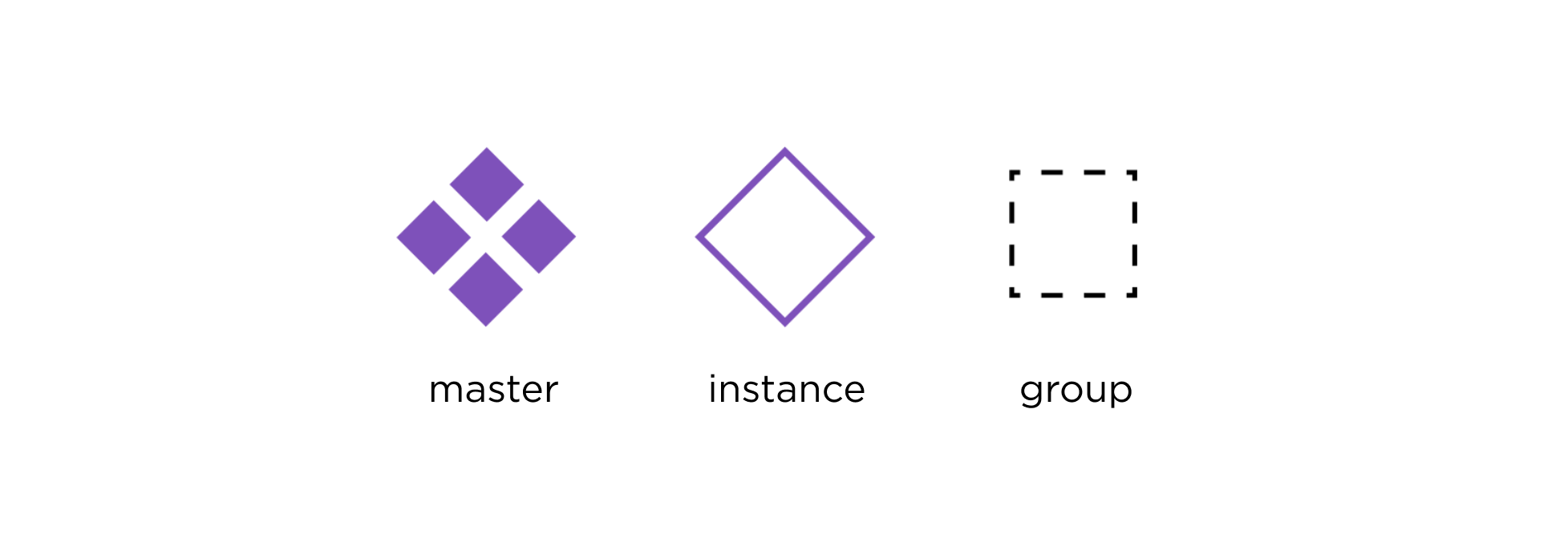
Figma offers different component types:
- Master component - defines the properties of the component
- Instance - a copy of the master
- Nested components - components in components
- Shared components - public, can be used across all files
- Dynamic components - scalable, resizable
Makes updates smooth and easy
Figma makes it easy to change the look of components consistently.
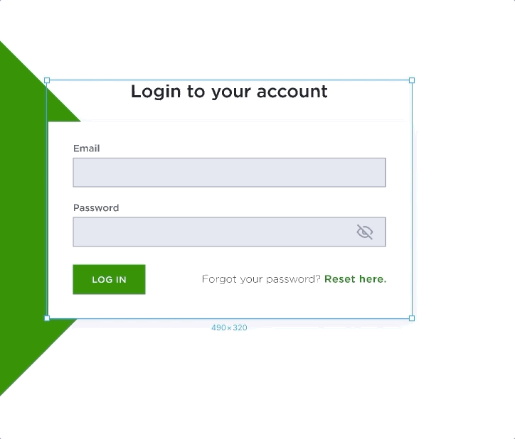
It wouldn’t be an option for us to change elements one by one in the whole pOS Design System if a given attribute (that affects a lot of components in numerous files) changes for some reason (like a button corner radius or a form field background color). As we use components, this won’t give us a headache. If we change a master component, the change will appear on all of its instances.
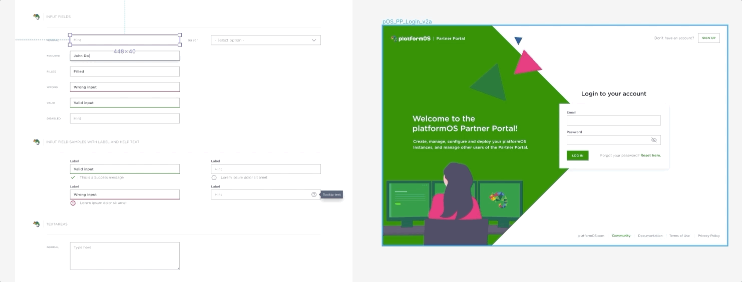
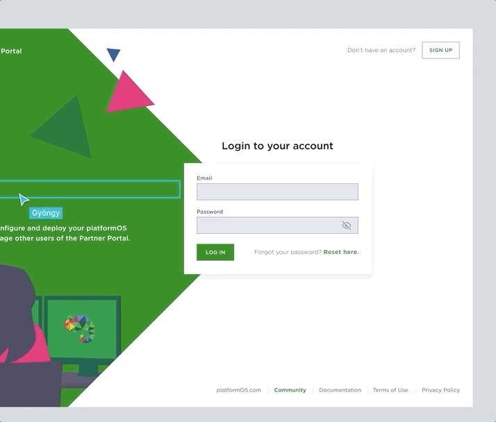
To demonstrate how great Figma is, in the sample above we changed the background color attribute of the master form field. As you can see, the background color of the instances changes immediately as well. Not just on the same frame but also in other files that use the same library, for example, the pOS Partner Portal’s login screen design. It is also possible to override some attributes of the instances, like text inside them, color, or border size, without changing their master component.
Responsive components
You can create responsive components as well with constraints. Constraints tell Figma how objects should respond as you resize them, how they should look on different screen sizes and devices.
You can define if you want a component to spread from left to right, from top to bottom or stick to the left or right, etc. and it will adapt to the given width automatically.
Collaboration
Figma is a powerful collaboration tool. Not only in internal collaboration with other designers but also between different teams, like designers and developers. It can also be used for external communication, you can present your ideas to the client using Figma and collect feedback, too.
Collaboration between designers with Team Libraries
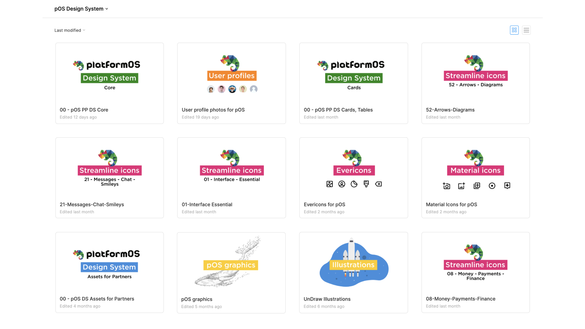
Our Team Libraries created in Figma work as a single source of truth for all the team members who work on the pOS projects.
We took components and predefined styles, put them in libraries, and shared them with the whole pOS team.

After sharing, the components and styles included in the given library became global, and they can be reached from every file or project where the library is enabled. With Team Libraries it is easier to maintain changes: when the editor of a component modifies an attribute and publishes it, the users of that component (usually other designers) will get a notification about the update and they can refresh the affected elements to keep the overall consistency.

During work, editors can watch live if someone is currently moving around or working on an element. This helps to avoid conflicts, as they won’t edit the same component at the same time.
Figma has a Version history, too. This also makes it sure that everyone who logs in and looks at the files will see the most up-to-date design. It is also notable that you can restore the previous file versions — even deleted master components can be restored.
We have several pOS libraries in our Design System:
- one for the pOS Core components
- some for other, more complex components, like cards and tables
- component based icon packs (Streamline icons, Material icons, Evericons, etc.)
- user avatar library
- libraries that contain other graphical resources, like illustrations, mockups, pOS brand graphics, etc.
- wireframing packs
Collaboration between teams with built-in tools
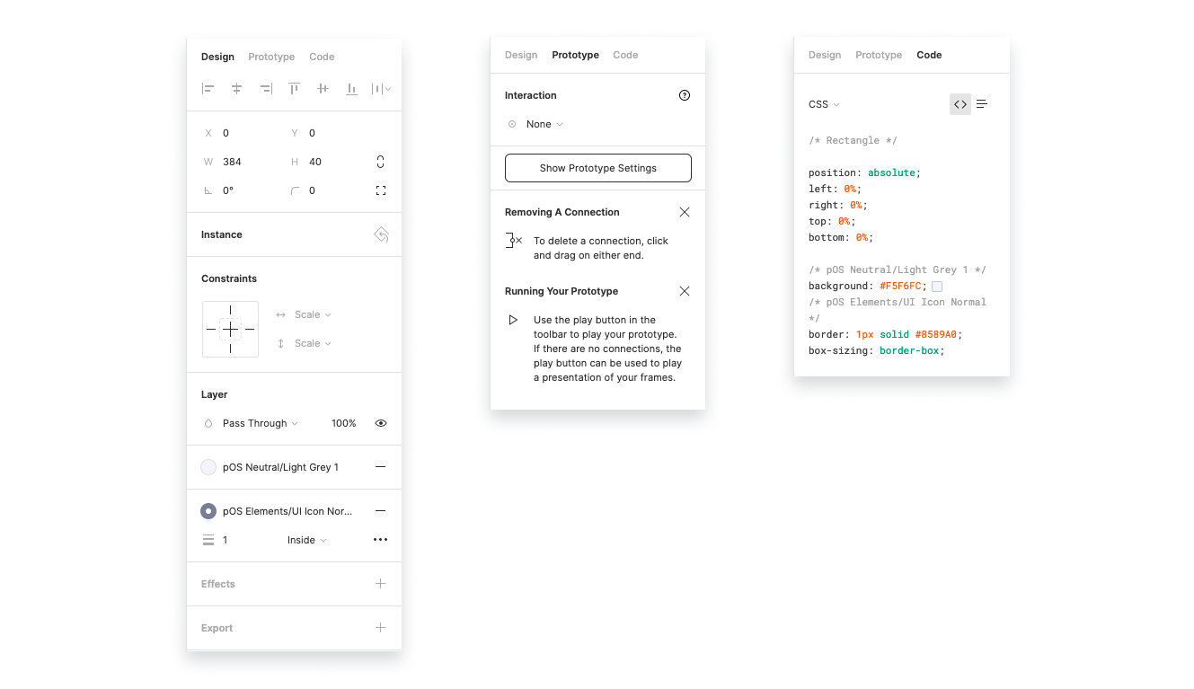
Figma helps collaboration between teams, too. Users with editor role can see three tabs in the right sidebar:
These tabs are:
- Design: for designers. It contains the Document styles and the properties of elements.
- Prototype: for UX designers. Here they can connect components and create interactive prototypes.
- Code: for developers. It contains a built-in inspector tool, where they can investigate the attributes of elements (text size, colors, alignments, etc.) and even download assets (images, icons).
Collaboration with clients
We use Figma for client communication and collecting feedback. Every user, either with editor or viewer role, can add, read and reply to comments, and Figma lists all of them in the right sidebar. You can filter for resolved comments too.
We can present our work to the client in Figma, using its Observation mode. If more than one person is looking at a Figma file, users can click on any avatar and see each movement and action of the person represented by that avatar. Combined with a call, it works as a screen share.
UI process
We used the Atomic Design method to build our Design System.
Atomic design is a methodology for creating Design Systems using modular, reusable components. Atoms are the smallest, basic building blocks that can’t be broken down further. Just like in the case of a set of Lego, we build the more complex components from these atoms, then we combine these complex components even further until we reach our goal.
Here are the steps that describe how we created the pOS Design System based on this methodology:
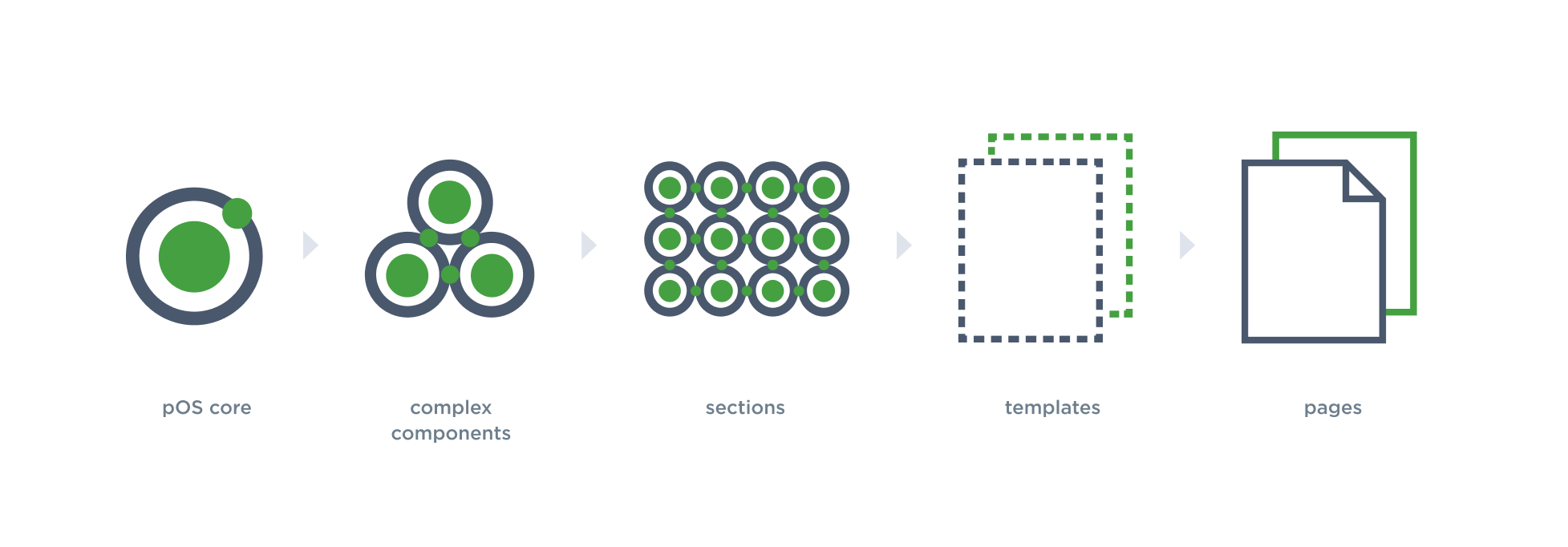
Design System core
As the first step, we defined the Brand basics, like colors, typography, grid, etc., converted them into styles, and shared them as a Team Library, so that they will be available from all documents. We also added the most common, simplest UI elements to our Design System core.
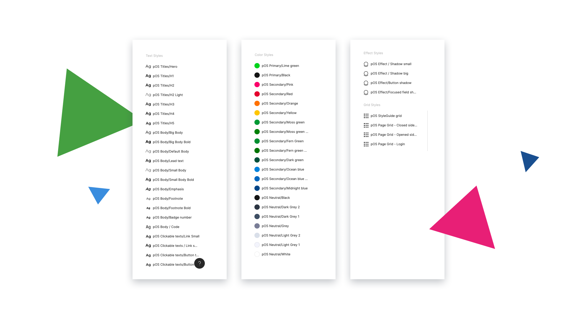
pOS core styles
- Text Styles: Headlines, body text, links, quotes, lists, etc.
- Color styles
- Effect Styles
- Grid styles
- Some commonly used, basic UI elements, like: buttons, form fields, notifications, etc.
Complex components
As the second step, we built more and more complex components using the core elements as building blocks. Sometimes these consist of instances of smaller components that are completely identical with their masters (e.g. buttons), but sometimes they use instances with overridden attributes (e.g. a basic form field but with a wider stroke), and in some cases components are nested into other components (e.g. cards containing text, buttons, and links).
- Cards (Content cards, Module cards, Billing cards, etc.)
- Tables
- Complex filters
- etc.
Sections
In this phase, we built complete page sections from the core and complex components.
- Header and footer sections
- Sidebar navigations
- Hero section versions
- Content sections
- Grid views with cards
- Step-by-step sections
- etc.
Templates, page designs
Finally, we combined the sections into pages. Of course sometimes we had to override a given attribute of a component or create new UI components, but wherever we could, we used instances of already existing master components to make sure that if we have to make changes, all of the page designs will get the updates.
We hope that our article showed you why Figma can be a great choice if you would like to build a Design System and that we gave you some insight into the process of our platformOS Design System creation that you can use yourself. In upcoming, more technical articles, we will tell you more about the Design System creation process: how to create styles, share libraries, use components, etc. Based on the experience we gained during the pOS Partner Portal project, we will show you step by step, how you can easily build your own Design System.
Stay tuned for part 3 of our series, where we will show you the developer handoff and the implementation of our Design System.